
Introduction
If you're new to WinUI 3 and want to get hands-on quickly, building a simple to-do list app is the perfect starting point. In this tutorial, we'll walk through some of the main concepts to understand when developing desktop applications with WinUI 3, while building a simple to-do list app.
To avoid overloading your brain, I will make the project as simple as possible by only using code-behind and XAML. In production applications where testing is required, it is recommended to use an architecture like MVVM; however, this tutorial will not cover that.
You can find the source code for this project on GitHub. You can either clone the repository and follow along or use the steps outlined in the guide to create your own.
Prerequisites
Before we get into the bulk of the guide and start looking at WinUI 3, let's talk about some prerequisites.
It should be noted that none of these are mandatory, but they will be helpful in allowing you to get the most out of this post.
- It is assumed that you have some basic knowledge of C#.
- You will need to have the latest version of the Windows SDK installed.
- You need to have Visual Studio 2022 installed & have the WinUI 3 Application Development workload installed, which can be done using the Visual Studio Installer.
Getting Started
- Open Visual Studio and Select
Create a new project. - Search for
WinUIand choose theBlank App, Packaged (WinUI 3 in Desktop)template. - Name the project
TodoAppand clickCreate.
In XAML, navigation between different pages in your app is handled through a Frame. A Frame serves as a container that can load and display pages by their type, enabling you to switch between them. Beyond simple navigation, it also provides features such as going back, viewing navigation history, and more.
Before setting up the Frame, we'll first create our homepage and use the Home page's type as the initial navigation target. Create Home.xaml in the root of your project.
Now head to MainWindow.xaml and add a Frame to the inside of the Grid. Give it a name of MainFrame by setting the x:Name attribute to MainFrame. You should now have the below within MainWindow.xaml.
The x:Name attribute is used to give an element a name allowing us to reference and use it in code-behind.
<?xml version="1.0" encoding="utf-8" ?>
<Window
    x:Class="TodoApp.MainWindow"
    xmlns="http://schemas.microsoft.com/winfx/2006/xaml/presentation"
    xmlns:x="http://schemas.microsoft.com/winfx/2006/xaml"
    xmlns:d="http://schemas.microsoft.com/expression/blend/2008"
    xmlns:local="using:TodoApp"
    xmlns:mc="http://schemas.openxmlformats.org/markup-compatibility/2006"
    Title="TodoApp"
    mc:Ignorable="d"
    >

    <Window.SystemBackdrop>
        <MicaBackdrop />
    </Window.SystemBackdrop>

    <Grid>
        <Frame x:Name="MainFrame" />
    </Grid>
</Window>
In XAML, each component can be paired with a code-behind file that defines its behavior, which will be the name of the element with a .cs suffix. For example, the code-behind file for MainWindow.xaml would be MainWindow.xaml.cs.
Every element you declare in XAML is actually an object with properties and methods, which means you can interact with them directly in the code-behind.
In this instance, when the app starts, we can create a Frame element in XAML and then use its Navigate method in the code-behind to load the Home page:
using Microsoft.UI.Xaml;
using Microsoft.UI.Xaml.Controls;
using Microsoft.UI.Xaml.Data;
using Microsoft.UI.Xaml.Input;
using Microsoft.UI.Xaml.Media;
using Microsoft.UI.Xaml.Navigation;
using System;
using System.Collections.Generic;
using System.Collections.ObjectModel;

namespace TodoApp;

/// <summary>
/// An empty window that can be used on its own or navigated to within a Frame.
/// </summary>
public sealed partial class MainWindow : Window
{
    public MainWindow()
    {
        InitializeComponent();

        MainFrame.Navigate(typeof(Home));
    }
}
Creating the ListView
Now, we'll create a ListView control which will be responsible for visually displaying our list of to-do items. First, we need to install the Community Toolkit package:
dotnet add package CommunityToolkit.MvvmNext, we will create a Todo class to represent each item in our list. The Title will be the task name, while the Done property will be used to indicate whether the task has been completed or not.
Usually, you would place this class in a separate file, but for the sake of simplicity, we will define it within Home.xaml.cs at the bottom of the file, outside the Home class.
public partial class Todo : ObservableObject
{
    [ObservableProperty]
    private string title = string.Empty;

    [ObservableProperty]
    private bool done;

    public Todo() { }

    public Todo(string title)
    {
        Title = title;
    }
}
The ObservableObject class serves as a base class that enables property change notifications. In practice, this means that whenever a property decorated with the ObservableProperty attribute is updated, the UI automatically reflects the new value. On the other hand, properties without the ObservableProperty attribute will not trigger UI updates, even if their values change.
Next, we will define a sample list of to-do items in our code-behind file. In Home.xaml.cs, in the Home class create an observable collection with the sample data defined below:
private readonly ObservableCollection<Todo> _items = [
    new("Morning workout"),
    new("Check emails"),
    new("Project task"),
    new("Grocery shopping"),
    new("Read or learn"),
    new("Evening reflection")
];
The observable collection type also automatically notifies the UI when the collection changes, so when an item is added or removed, it will also reflect in the UI.
Next, we can create the actual ListView to display the items. We'll add some padding so the element isn't so close to the edge of the screen. Then define two rows, the first row will only take as much height as it needs while the second row will take up the remaining space.
We will use the first row later on. The second row is what we will use to display the list of items.
<Grid Padding="30">
    <Grid.RowDefinitions>
        <RowDefinition Height="Auto" />
        <RowDefinition Height="*" />
    </Grid.RowDefinitions>

        <ListView
            Grid.Row="1"
            ItemsSource="{x:Bind _items}"
            SelectionMode="None"
            >

        <ListView.ItemTemplate>
            <DataTemplate x:DataType="local:Todo">
                <Grid Padding="0,10">
                    <TextBlock Text="{x:Bind Title}" />
                </Grid>
            </DataTemplate>
        </ListView.ItemTemplate>

    </ListView>
</Grid>
To display the _items collection, we bind it to the ListView's ItemsSource. We then define a DataTemplate with an x:DataType to specify the item type. Inside the template, we can bind individual properties to UI elements, which in this case we use the TextBlock to display each todo's title.
Styling the ListView
We want to make our ListView items have a different color from the background so there is some visual difference. We can modify the style of each list container by using the ListView.ItemContainerStyle property and set the Background property to LayerFillColorAltBrush.
<Grid Padding="30">
    <Grid.RowDefinitions>
        <RowDefinition Height="Auto" />
        <RowDefinition Height="*" />
    </Grid.RowDefinitions>

        <ListView
            Grid.Row="1"
            ItemsSource="{x:Bind _items}"
            SelectionMode="None"
            >

        <ListView.ItemContainerStyle>
            <Style BasedOn="{StaticResource DefaultListViewItemStyle}" TargetType="ListViewItem">
                <Setter Property="Background" Value="{ThemeResource LayerFillColorAltBrush}" />
            </Style>
        </ListView.ItemContainerStyle>

        <ListView.ItemTemplate>
            <DataTemplate x:DataType="local:Todo">
                <Grid Padding="0,10">
                    <TextBlock Text="{x:Bind Title}" />
                </Grid>
            </DataTemplate>
        </ListView.ItemTemplate>

    </ListView>
</Grid>
We set the TargetType to ListViewItem so the style is applied only to ListViewItem controls. By using the StaticResource tag, we instruct XAML to retrieve that style from the resource dictionary.
Unlike a StaticResource, a ThemeResource is dynamic: it can automatically adjust its value based on the current app theme. In this case, it ensures that the color adapts depending on whether the user is in light mode or dark mode.

The name of the items will be different in the screenshot because I decided later on to use different names.
Unlike CSS (Web Development), modifying an element's style in XAML replaces its default styling. To preserve the default styling while adding your own, you can use the BasedOn attribute.
Adding a To-Do
Now that we can display the current list of to-do items, the next step is to allow adding new ones. We'll create an input field where users can type a todo. When the field is focused, pressing Enter (or clicking the accompanying button) will add the current text to the list.
Above the ListView add the following code:
<Grid
    Grid.Row="0"
    Margin="0,0,0,20"
    ColumnSpacing="10"
    >
    <Grid.ColumnDefinitions>
        <ColumnDefinition Width="Auto" />
        <ColumnDefinition Width="*" />
    </Grid.ColumnDefinitions>

    <Button Grid.Column="0" Click="AddTodoButton_Click">
        <SymbolIcon Symbol="Add" />
    </Button>

    <TextBox
        x:Name="AddTodoInput"
        Grid.Column="1"
        KeyUp="AddTodoInput_KeyUp"
        />
</Grid>
The button will only take as much space as it needs, while the text box will take up the remaining space. We also need to assign the Textbox a name so we can access it in the code-behind.
In XAML, we can wire up an event handler that will be triggered everytime a certain event is fired. In this case, whenever a key is pressed while the textbox is in-focus the AddTodoInput_KeyUp method will be executed. Similarly, for the button, whenever it is clicked the AddTodoButton_Click method will be executed.
Now that we have attached our event handlers, we need to actually add the method that will be executed when the event is fired.
In Home.xaml.cs, add the first method:
private void AddTodoButton_Click(object sender, RoutedEventArgs e)
{
    _items.Add(new(AddTodoInput.Text));
    AddTodoInput.Text = string.Empty;
}
This method grabs the text from the textbox and creates a new todo in the _items collection. Since we are using an observable collection, the UI will automatically update to reflect the new item. Once the todo has been added, we clear the text input field.
Add the second method:
private void AddTodoInput_KeyUp(object sender, KeyRoutedEventArgs e)
{
    if(e.Key == VirtualKey.Enter)
    {
        AddTodoButton_Click(sender, e);
    }
}
This method checks if the key pressed is the Enter key. If it is, it will execute the AddTodoButton_Click method, so it would be the same action as clicking the Add Button.
We now have a way for users to add new to-do items.

Deleting a Todo
The next logical step is to allow users to be able to delete todo items. We will modify the ListView.ItemTemplate to include a clear button, which when pressed will remove the item from the collection.
<ListView.ItemTemplate>
    <DataTemplate x:DataType="local:Todo">
        <Grid Padding="0,10">
            <Grid.ColumnDefinitions>
                <ColumnDefinition Width="*" />
                <ColumnDefinition Width="Auto" />
            </Grid.ColumnDefinitions>

            <TextBlock
                Grid.Column="0"
                VerticalAlignment="Center"
                Text="{x:Bind Title}"
                />
            <Button
                x:Name="DeleteTodoButton"
                Grid.Column="1"
                Click="DeleteTodoButton_Click"
                Style="{StaticResource AlternateCloseButtonStyle}"
                >
                <SymbolIcon Symbol="Clear" />
            </Button>
        </Grid>
    </DataTemplate>
</ListView.ItemTemplate>
We want the text to occupy most of the available space, while the clear button should only use the space it requires. The AlternateCloseButtonStyle provides a default close button style that integrates well with the current UI design. Finally, as we've done previously, we'll attach the DeleteTodoButton_Click method to handle the button's click event.
In Home.xaml, when we set the ItemsSource of the ListView to our _items collection, each item in that collection automatically becomes the DataContext for its corresponding ListView.ItemTemplate. This means any child element inside the template can directly access the current item's value through its DataContext.
Now you can head over to Home.xaml.cs and add the method to handle the Delete button's click event, which accesses the current item's DataContext to remove the item from the collection:
private void DeleteTodoButton_Click(object sender, RoutedEventArgs e)
{
    if(sender is Button { DataContext: Todo item })
    {
        _items.Remove(item);
    }
}
To remove an item, we use C# pattern matching in the button's click handler. First, we check whether the sender is a Button. Then, we verify that its DataContext is a Todo. If both checks pass, we have the exact todo item bound to that button, and we can safely remove it from the _items collection.
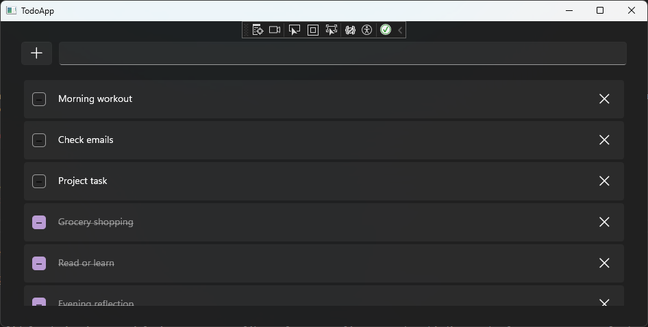
Now, when the button is clicked, the item will be removed from the list.

Marking Items as Done
The final step is to allow users to mark items as done. We will modify the ListView.ItemTemplate to include a checkmark button, which does exactly that. Wrap the TextBlock in a CheckBox and bind the TextDecorations & Opacity property to Done.
We'll use a two-way binding for the IsChecked property so that when the user selects the checkbox, the Done property of the current Todo item is updated to true. With a one-way binding, this interaction wouldn't work, the Done property could only be updated programmatically, not directly from the UI.
<CheckBox
    Grid.Column="0"
    VerticalAlignment="Center"
    IsChecked="{x:Bind Done, Mode=TwoWay}"
    >
    <TextBlock
        Margin="10,0,0,0"
        Text="{x:Bind Title}"
        Opacity="{x:Bind Done, Converter={StaticResource BoolToOpacityConverter}, Mode=OneWay}"
        TextDecorations="{x:Bind Done, Converter={StaticResource BoolToStrikethroughConverter}, Mode=OneWay}"
        />
</CheckBox>
"The converters will map the Done property's boolean value to both a TextDecorations value, which applies a strikethrough to completed items, and an Opacity value, which visually fades them out by making them appear greyed out."
In Home.xaml.cs, outside of the Home class, add the converters:
public class BoolToStrikethroughConverter : IValueConverter
{
    public object Convert(object value, Type targetType, object parameter, string language)
    {
        if(value is bool done)
        {
            return done ? TextDecorations.Strikethrough : TextDecorations.None;
        }

        return value;
    }

    public object ConvertBack(object value, Type targetType, object parameter, string language)
    {
        if(value is TextDecorations textDecorations)
        {
            return textDecorations == TextDecorations.Strikethrough;
        }

        return value;
    }
}public class BoolToOpacityConverter : IValueConverter
{
public object Convert(object value, Type targetType, object parameter, string language)
{
if (value is bool done)
{
return done ? 0.5 : 1;
}
return value;
}
public object ConvertBack(object value, Type targetType, object parameter, string language)
{
if (value is double opacity)
{
return opacity == 0.5;
}
return value;
}
}Again, we use pattern matching to check whether the value is a bool and either strikethrough & grey-out the text or remove the strikethrough and restore the original color. The ConvertBack method would be used in two-way binding scenarios, so it's not necessary for this example.
Finally, to use the converter in our markup, we need to define it as a page resource. Inside the Page paste the following XAML:
<Page.Resources>
    <local:BoolToStrikethroughConverter x:Key="BoolToStrikethroughConverter" />
    <local:BoolToOpacityConverter x:Key="BoolToOpacityConverter" />
</Page.Resources>
Now, when a todo is checked, its text will fade to grey and a strikethrough will appear, indicating that the item has been completed.

Conclusion
You should now have a solid foundation in essential WinUI 3 concepts like UI layout, Styling XAML, data binding, and value converters. To further improve the app, you could try adding a database which will allow us to persist the todo items between sessions or add a search bar to filter the list of todos.